Tuesday, 16 December 2014

Drafting & Planning: Contents Page.

First I moved this photo into publisher, so I could turn it black and white. After this, I saved it as an image and imported it onto PagePlus so that I could work around it.


Here I edited the colours of my fonts and backgrounds. I have used grey as it matches with the image above it, and also because it does not clash too much with my house style. I decided to continue to use 'Impact' font for the titles on my contents page because I have used it on my front cover and i want my magazine to be holistic.

Final Draft:


Monday, 15 December 2014

Drafting & Planning: Double Page Spread.

For my double page spread I decided not to use publisher at all as PagePlus is much easier than Paint.net to arrange fonts on. I cropped the image a lot so that my model was the centre of the image. First I added a pull quote and a interview title in colours fitting my house style.

The finished draft:


I will add the page numbers on the final piece.

Sunday, 14 December 2014

Drafting & Planning: Front cover.

I have used paint.net to place my coverstar over my masthead, and also to crop the main image. Afterwards, I moved the flattened image to a publisher document, where i added my pug, puff, coverlines and secondary image.
I will probably add more coverlines on for my final piece because the cover isn't cluttered enough for a magazine similar to Rocksound or Kerrang!.

Saturday, 13 December 2014

Organisation: Photo Selection.

Front Cover:
I will add a little more saturation to this photo, and I will also crop it so that my cover star is right in the middle of the image.

Secondary Image for the front cover:
I will crop this image into a more square shape so it takes up less room on the front cover.

Contents Page:
I will crop this photo so that the red carpet is showing less, and so the table is out of sight. 
I will turn this photo black and white so that it fits in with my house style (red, black, white) better.

Double Page Spread:
I will also crop the desk out of this photo, and I will leave less space above the model's head. I will not edit the colour in this photo as it has the right lighting and background colours.

Secondary Image for Double Page Spread:
This photo was taken to link in with one of the interviewer's questions in the double page spread. This photo will not have its colour edited, but i may need to crop it substantially as it shouldn't take away space for my text.


Thursday, 11 December 2014

Monday, 8 December 2014

Drafting & Planning: Draft Article Content.


Most Kerrang and Rocksound interviews only have 9 or 10 questions so I need to create 9 good quality questions that allow my artist to expand.


Pull Quote: "I'm so damn sick of hearing from people that drugs are fun."

Intro: Fiery. Diva. Ruthless. Francesca is well known for being a woman you don't want to mess with. Stone Cold magazine managed to get hold of Thorns and Roses frontwoman, between partying and songwriting, to discuss the dangers of drugs, the wrongs in the writing and the beauty in betrayal.

1. Interviewer: Hey Francesca! I heard we're pretty lucky to fit into your schedule today.
Me: (laughs) In a way yes. I'm going to a CD signing this evening but I'm always glad to promote my music in Stone Cold.

2. Interviewer: Tell us about Chemical Lungs. What's the meaning behind it?
Me: It's an uncomfortable topic for me. The 'chemical' part is about my best friend's drug abuse. He totally destroyed himself with it. He started off just re-creationally at parties but he just lost control and wrecked his body. I can't count the times I ended up taking him to hospital because he almost overdosed. It broke my heart.The 'lungs' part is about my emotion. I tried my hardest on this album. I really poured my heart into it so hard that sometimes I hurt my lungs singing. Sometimes I just cracked up because the lyrics stopped being lyrics and began to be how I really felt.

3. Interviewer: That's pretty heavy stuff. What do you think your listeners will think of it?
Me: I hope it will discourage them from taking drugs. Its so publicized that drugs are cool and will fix your problems but they just don't. They just create more. I'm so damn sick of hearing from people that drugs are fun. I hope people appreciate that the emotion isn't fake. If I sound like I'm almost crying I probably am (small chuckle).

4. Interviewer: Some of the songs on Chemical lungs are pretty angry though. Will you give us an insight on why that is?
Me: I wanted to kick the rumours that Thorns and Roses were going soft up the arse. Just because we've learnt our lessons about drug and alcohol abuse doesn't mean that were not rock stars. We're just not stupid little kids anymore. More to the point this album shows my anger about my ex band mates and the people who let my friend get his hands on drugs. I had enough.

5. Interviewer: I don't blame you dude. Getting off the topic of bad friends, tell me some info about the CD.
Me: I'm really proud of it! It features the track 'Old Blue' and there's a code to download it onto a computer. Its £9.99 and its in all good music stores, as well as on Amazon and it's currently on half price offer on the Stone Cold website. So get buying people!

6. Interviewer: I'm sure they will! We've got some questions that our readers have sent in that we hoped you'd answer. Whats the best rumour you have heard about yourself?
Me: (laughs) I think the best one is that I'm a lesbian. It made me wonder if I really come off that way. It was really weird because I was in a relationship with a guy when that rumour came out.

7. Interviewer: What inspires you to write?
Me: Past loves, current loves, the extremes of emotion. It really sucks getting writers block because it usually happens to me when i'm at my happiest. I guess i just like having something to complain about (laughs).

8. Interviewer: Who were your musical inspirations as you were growing up?
Me: I really liked Arctic Monkeys and alternative hip hop artists like Odd Future, but most of all it was the Antichrist Superstar. I really look up to Manson, he's endlessly intelligent and witty. He just puts words together so well that it left me thinking about a line for weeks on end. Marilyn Manson and the rest of his band is just the ideal of rock stardom to me. I can only hope that Thorns and Roses can become as successful as them.

9. Interviewer: Whats the most important thing for you in being a frontwoman for a popular new rock band?
Me: Influence. Its vital to me that I have a positive influence on kids. So many rock and metal bands are accused of making kids so crazy things; suicide, school shootings, taking drugs. And yeah fair enough I do write some controversial lyrics but I just never want to be known as the person who made someone hateful, or self harm, or take drugs. I want the kids to know you can love rock music and still love life.

Saturday, 6 December 2014

Target Audience: Audience demographic.

Example used: Rocksound featuring You Me At Six.
The audience demographic is the different areas in which the population is split up. You can identify the audience demographic from the presentation of the front cover.

Age: 15-24

Gender: Both genders, but mainly male. I have found this informant from my research about Rocksound, but also from the house style. It is edgy enough to attract the attention of a typical rock-loving man, but can also attract female readers as the band members pictured can be considered attractive, and are photographed in an appealing way. This happens frequently on Rocksound covers.

Likes: Rock music, physical CDs, concerts. The cover shows me this

Dislikes: Majority of pop music. The cover shows me this as it advertises both soft and hardcore bands, but no pop music stars.

Attitudes: The cover tells us that the readers have a rebellious attitude towards life. I can infer this from 'Its us against the world!' I can also infer that the readers may be quite excitable as the house style is far from subtle, with red and yellow being bright and contrasting colours.

Register: The register of the magazine is the tone of the language. I can infer that the readers may be outsiders, as they will be able to identify with 'It's us against the world!' way of thinking.

Sunday, 30 November 2014

Target Audience: Rocksound.

I found a Blog on the internet with information about the current Rocksound audience.

The average reader's are aged 15-24, which is quite young, and that 72% of the audience are men. Similar to the Kerrang! magazine target audience, Rocksound's audience will use their magazine as a source of new fashion and trends more than any other source on the market. Staying connected is a very important part of their lives, they value being constantly updated, and the ways readers connect with Rock Sound is Print, Web and Social Networking. 82% of their audience use at least two of these methods to stay connected with their Rock Idols, and in total they spend roughly £114 million a year on music and gig tickets. I have also found that there is an online edition of Rocksound and opportunities online for the readers to share Rocksound articles to social networking websites such as facebook and twitter.


This shows me that I will need to target some of my headlines on my final piece more towards men, and I will have to include elements of social media within my magazine in order to keep the interest of my target audience.

Thursday, 27 November 2014

Organisation:Tracker Update.

I have got good marks for similar products and drafting, but I need to improve on the Target Audience section. I will do this by studying the age and gender of people who buy Rocksound, by researching statistics from the internet.

In addition to this, I will need to create more organisation posts. I will do this by creating a publication plan for my magazine, allowing me to know exactly what needs to be put into my magazine when I begin creating it.

Tuesday, 25 November 2014

Drafting & Planning: Stone Cold fonts.

I researched whether Stone Cold Magazine and it does not. 'Stone Cold Magic' exists, but it is not a rock magazine, in fact it is not a music magazine at all. It is an online magazine about magic tricks, so I can use 'Stone Cold Magazine' for my magazine masthead.


http://www.fontspace.com/


1 is best, 6 is worst:

1. I think 'Nexa Rust' is the best font to use for my magazine because it is a very clear font. It is bold and would be able to be spotted in the Left Third very easily. It will be easy to change into different colours, which allows me to be creative with my house style.

2. 'Scribble Box' is my next favorite font because it is also clear and bold, and would be able to be an effective masthead. The reason why i will not use it on my magazine cover is because it is partly see-through, so i would be restricted with using different house styles because colours would be visible through the masthead.

3. I think 'My Girl Is Retro' is my next favorite font. It is attractive and would grab attention in the left third but it would be more suited for a 70's/80's music magazine rather than a modern rock magazine.

4. I have chosen 'Urban Jungle' font to be the nest worse font because it would be more suitable for a hip-hop magazine, plus the cut outs of the city make it too unclear to be an effective masthead.

5. I think 'Hard Rocks' is the next worse font. Although it fits in with the urban, slightly punk ethos of my magazine, it is too scratchy and unclear to be an appealing masthead for my magazine.

6. I have chosen the 'True Lies' font as the worst because it inappropriate for a music magazine. It appears to be have been created with a paintbrush, which is irrelevant for a rock magazine. Although on its own it is an attractive font, it is too thin to be an eye-catching masthead because you would not be able to see it on the Left Third on a shelf.


Saturday, 22 November 2014

Organisation: Photoshoot for the final piece.

Date: 11th December

Location: 
Drama studio in school against a plain black wall.
Alternative Location: Cannon Hill park in the band stand. I want to sue this because it create a trippy effect when it is put into black and white.

Effects if I use Cannon Hill- Front Cover: I will attempt a focus pull between me and the forest in the background. I will be the cover star, so the image of me needs to be clear. I will blur out the background which shows the forest to bring more attention to me. As the camera i use produces the best quality picture when the camera's flash is on, i will lower the lighting for the cover photo, as i do not want ti to be particularly bright. This is because darker colours conform more to the ideology of magazines similar to Rocksound.

Effects in Drama Studio-Front Cover: No effects will be needed as the walls in the studio are black.

Effects on contents page: I will get my peers to throw their hands in the air like they are at the concert, then i will drain the picture of colour so it is black and white.

I do not plan to use any effects on my secondary images or additional images in my magazine.

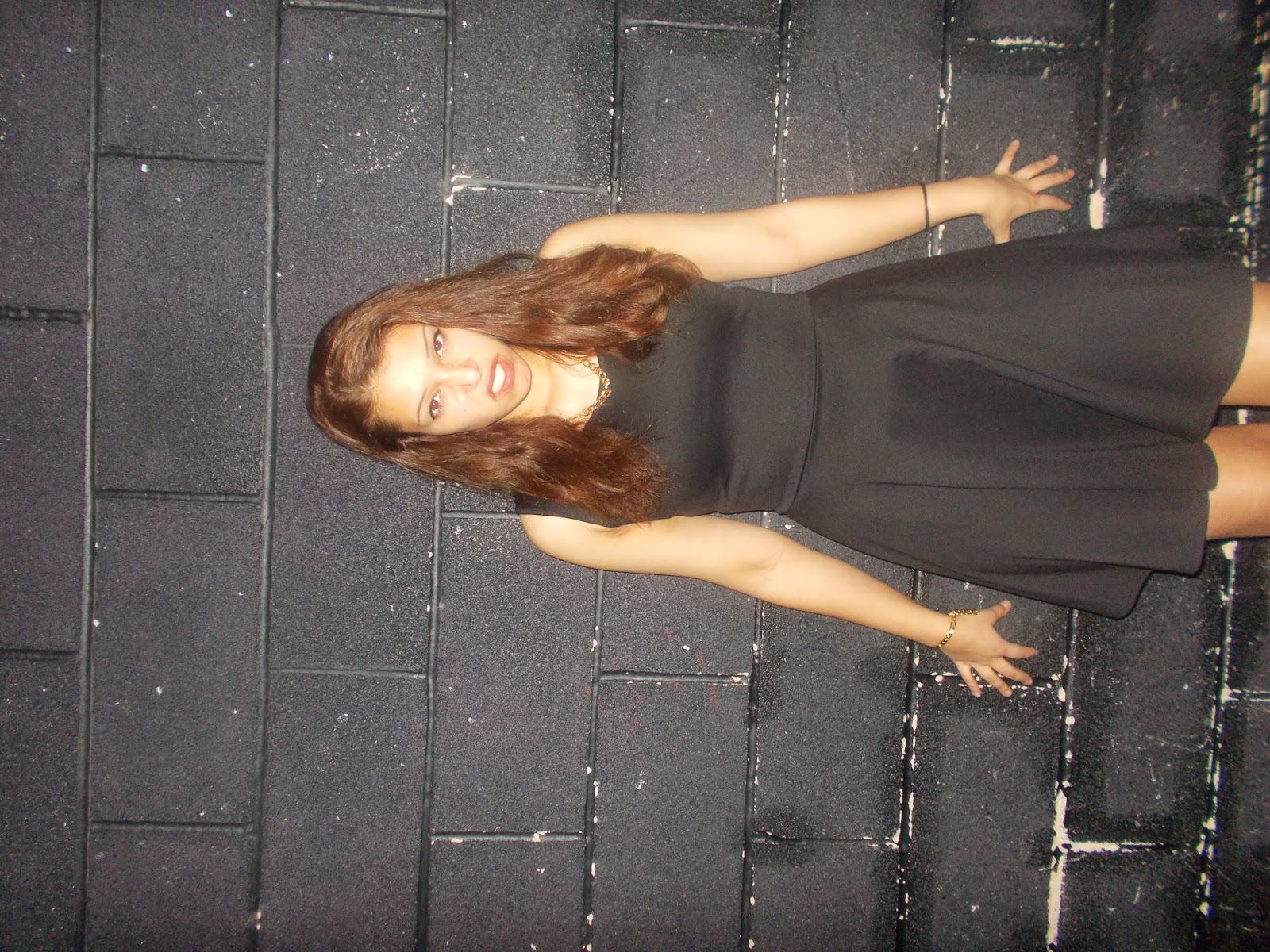
Costume: A black dress and black heels. This conforms to the ideology of magazines similar to Rocksound, and also allows me to be creative with house style colours, as most colours are easy to see over black. I will wear the same costume throughout.

Make-up: Large and dramatic black eyeliner. Red lipstick.

Members: Although the band I have created has 3 members, I will be the only one in the photos because I am portraying the lead singer.

How: I would prefer to have my friends help with the main areas of my photoshoot, but if need be I can do some parts on my own because my digital camera has a timer option.

Thursday, 20 November 2014

Drafting & Planning: Page Plus


I have practiced creating a cover, contents page, and double page spread on Page Plus. I feel it is important to familiarise myself with this software so i can make the best quality project that i can when i make a  cover, contents page, and double page spread with my own pictures.
I am happy with my practice on page plus because it is holistic, and has an intimate consistency. This is because I used the same quote on two pages, the same artist throughout, and similar fonts throughout.

Monday, 17 November 2014

Drafting & Planning: Influences.

Although I have researched magazines such as Kerrang! and Metal Hammer, my main influence will be Rocksound magazine. This is because I find Kerrang!'s carnivalesque style a little too immature for my target audience.

I am aiming for my magazine to look like this. 

My survey results from surveymonkey has given me the information that my target audience believes the house style of a rock magazine should be consistently red. 

My research about the demographic and content of Rocksound has given me the information that my front cover should have a pug on it informing the readers that my magazine is offering a free CD.

I have chose to begin to base my final cover from this magazine because my cover will also feature the front-woman on her own in the main image.

This magazine cover is very effective because it incorporates symbiosis and pugs, as well as many of the codes and conventions of modern rock music magazines such as a bar code and masthead.

Although I was originally planning to do all of photography inside, this magazine has swayed me to attempt some outdoor photos, then blur the background so not to take the attention away from the cover star.

Saturday, 15 November 2014

Target Audience: Who is Rocksound's demographic?


For those who like their music loud, extreme and non-conformist. Rock Sound magazine is the essential music mag for anyone who like to thrash a guitar and look epic doing so. 

This title is aimed at rock music enthusiasts. It covers news, reviews,features,interviews and gigs for current and past rock music.


Rocksound aims to cover 'music with attitude'. It is a fresh and exciting rock magazine, especially for teenagers. It is aimed at the older end of young people (16-24) rather than the more immature end of young people (12-15). This is evident by the mature layout.


Covering Punk, Metal, Hardcore, Alt and Rock music, Rock Sound is packed with interviews with emerging and established musicians and features on up-and-coming and already famous bands. This is a properly authentic magazine – no sell-outs here – that brings you the very best of guitar-based music. Inside are reviews of the latest releases and classic re-issues, and details of gigs and festivals all over the country, and there is often a sample CD given with each issue which helps attract an audience.


Rocksound has 12 issues produced per year (monthly) magazine. The usual price is 3.99.


Along with the feedback from my surveymonkey questionnaire, this research was very informative because I want to incorporate similar things to the content of Rocksound into my magazine. I must feature rebellious, non-conformist appearing artists, and the cover lines must be exciting and interesting, but not as carnivalesque or 'in your face' as Kerrang magazine.


http://www.newsstand.co.uk/195-Rock-Music-Magazines/9267-Subscribe-to-ROCK-SOUND-Magazine-Subscription.aspx

Thursday, 13 November 2014

Blog Tracker Update 12 November 2014

I am really pleased with this tracker because it reassures me that I am making large amounts of progress.
Although I have no red sections left, I still need to do more posts about organisation. Along with this, I know that I need to do more research about a target audience in order to get good marks.

Organisation: Evaluation of Remake, Remodel Task.

The Remake, Remodel task that we have been doing for homework and in class has helped me to learn about a consistent cover page, contents page, and double page spread.

It has helped me to discover the ways I can make a holistic and coherent layout, while keeping a consistent and attractive house style. I have done this by staying consistent with the colours and fonts within the house style. It has also helped me to learn about photography, and the distances from the camera that the cover star should be because I had to select the correct photo and edit it in the correct way in order for it to conform to the codes and conventions of music magazines.

The task will assist me to create my covers in the future because I can use the drafts of the cover, contents and double page spread as a basic layout for my final piece.


Tuesday, 11 November 2014

Organisation: Front Cover Layout.

I will use the Remake Remodel task that I have done recently to help me with layout in the future.

I have learned to make my price and dateline less prominent on my cover.

Here are some photos that I thought were not effective enough to use on my magazine cover:


I didn't want to use the first one because my finger are not placed in a claw-like position, so there wasn't enough aggression in the photo.
The second photo is okay but there is too much space at the top, and you can see my radiator in it. My cover would have looked very unprofessional if my radiator could be seen, especially on a Rock-Genre magazine.
As I planned a Halloween edition of Rocksound, I wanted to use costume props. However, in the third image, I found that using more than one took too space up, and constricted my body positioning. Also, I am smiling in this last photo which would not go with the ethos of Rocksound magazine, as their cover stars usually look brooding or rowdy.

Looking back on the photoshoot I did for the Remake Remodel Task, I will try to find a plain white wall so that I can manipulate my colour scheme more. Having a purple wall restricted me to using red as you couldn't see many other colours very clearly. I will also take slightly less zoomed in pictures to allow for a more professional layout concerning secondary images and secondary stories and coverlines.